
When we need a way to think through interface structure before building it in FileMaker, we turn to Figma, an online prototyping tool. This step helps us avoid rebuilding layouts when the workflow doesn’t make sense. More recently we’ve been using Figma to help with web-based design projects, particularly in conjunction with FM Better Forms (now Klai).
If you’re new to Figma, it can be a little overwhelming to get started. Over the course of our projects, we’ve learned some practical tips that have saved us time and provided consistency.
Start with structure, not styling
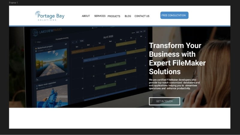
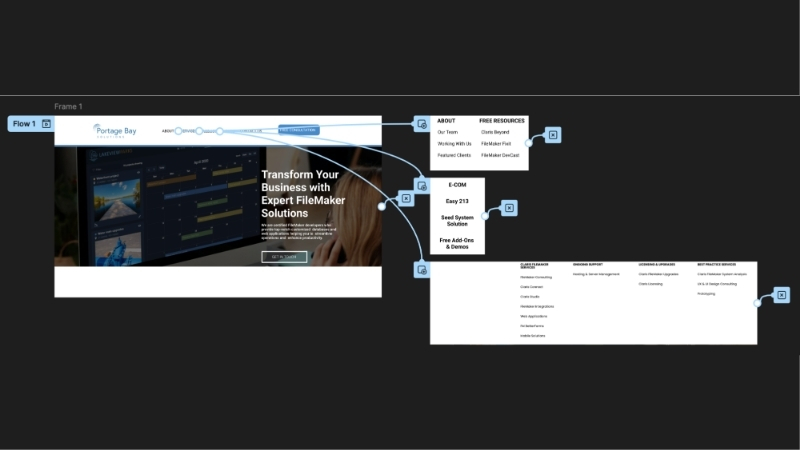
In Figma, everything lives inside a frame. Frames represent the space a user sees, but not the limit for information. Images can flow off of the frame to allow for scrolling or other actions.
Frames can also be nested. Smaller frames can reside inside of bigger frames and become a single item with multiple layers to it. This setup allows you to move multiple pieces as a single frame rather than dragging everything individually. Even still, you can have all of your information in one place and still be able to edit and tweak the separate frames.
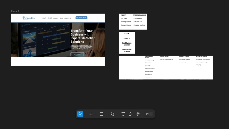
We treat frames as structure. Structure in the mock-up should reflect the structure in the build. If a section is meant to be modular in FileMaker or FM Better Forms, it gets its own frame. If something would logically be grouped in a layout, we nest frames accordingly.
Following this method makes later adjustments predictable. When a client decides to move a section, or when we realize something belongs in a popover instead of inline, we can move these groupings and not worry about untangling loose objects.
Create components for repeating elements
When we find ourselves repeatedly using an element, we convert it into a component. Example uses include:
- Navigation bars
- Buttons
- Form sections
- Cards
- Repeating row structures
Creating a component is easy. Start with a regular frame and then press option + command + K.
The frame should now show a purple border and will serve as the parent component. When you need to use the component, copy and paste it into your workflow. When changes are made to the parent component, all copies are also updated across your design.
You can also fine-tune an individual instance; it should be noted, however, that only the attributes that were not changed will update when the parent component is altered. For example, changing the color of an individual instance will maintain that color even if the parent component’s color is changed.

Components give us a single source of truth. If padding changes or a button style gets adjusted, it updates everywhere. This connection prevents subtle inconsistencies that can creep in when items are duplicates or manually tweaked. Using components forces us to think in systems instead of screens.
Make spacing deliberate
FileMaker has provided grids for some time. However, many developers have ignored this feature, eyeballing the placement of objects on a layout, which can lead to a poorer UI experience for users and inconsistency across layouts. Most of us can tell when something is truly off, but it’s those subtle, barely-notieceable misalignments that creep in and give a poor feel overall.
In Figma, we use layout grids based on increments. There are many schools of thought on what increment to use for spacing, but we’ve had a lot of success using a 4pt (pixel) structure. Some prefer increments of 10 because they are easier to calculate. Another option is basing increments on screen resolution (72 or 96). Designers who come from a printing background might recommend spacing based on the default line height of the primary font.
Whichever method you choose, sticking with a grid allows elements to be aligned consistently across all layouts and makes it easy to add new elements in position more easily.

Trust me, I know a shortcut
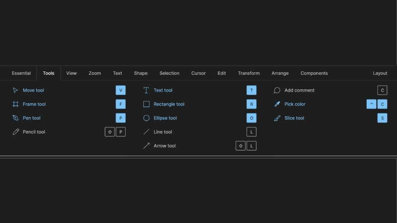
Most people know the basic computer shortcuts, such as copy, paste, cut, etc. With Figma, there is a shortcut for nearly everything. Shortcuts allow you to work faster and keep your momentum going.
To see a list of all of the shortcuts, click the question mark in the lower right corner of the screen. Then click keyboard shortcuts.
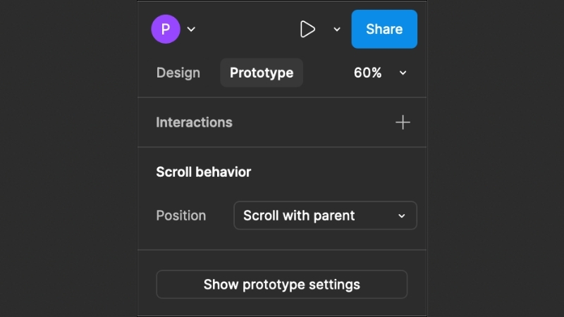
Prototype later
It’s tempting to jump into interactions right away, but we’ve found that starting with the overall structure first is the most efficient way to proceed. Once the hierarchy feels stable, we switch to the Prototype tab and start wiring up interactions.
Here you can decide the trigger, such as clicking, dragging, hovering, etc., as well as the action, such as navigating pages, opening a link, scrolling, and more. The interactions clarify the workflow instead of distracting from it.
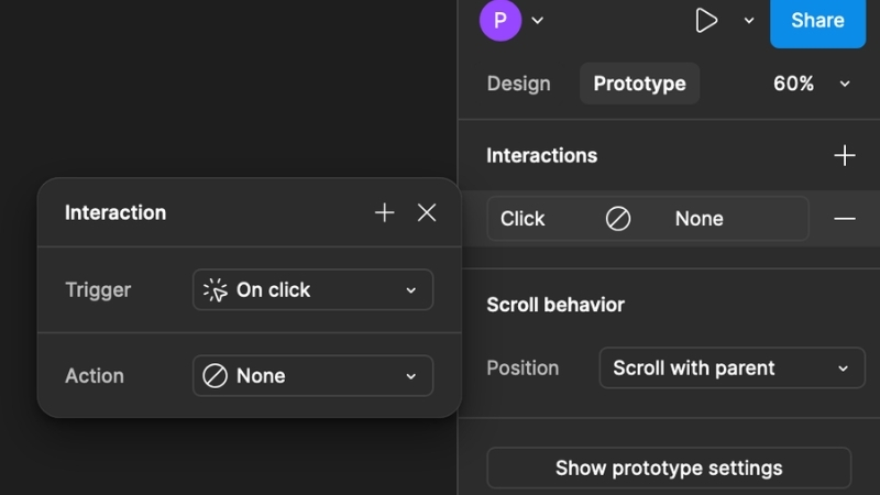
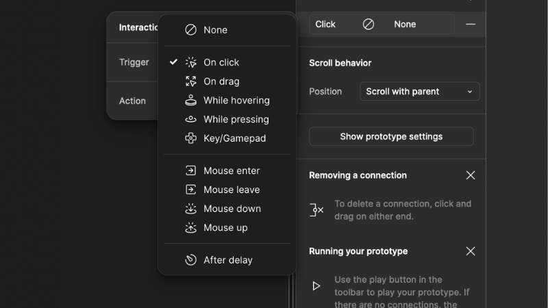
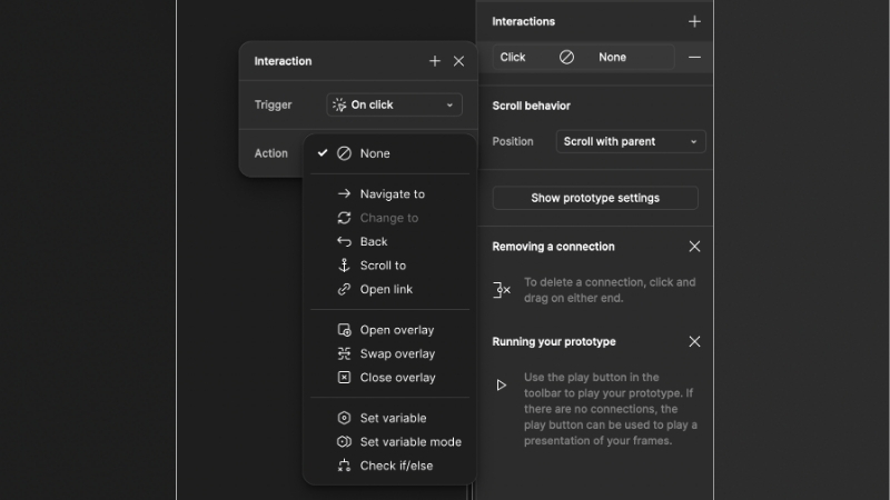
One important note to keep in mind when you’re designing your mockup is that each trigger can only be used once per frame. For example, having two interactions that work when something is clicked will confuse the system and cause issues during testing.
Designing with the build in mind
Designing a project, no matter how big or small, will always come with its own set of challenges. Sometimes one of those challenges is just how many tools Figma gives you to work with. Learning each one and how to use it properly takes time, but these skills will help you out in the long run.
The goal isn’t to create a perfect visual. It’s to reduce ambiguity before development begins. When a mockup clearly communicates structure and intent, client conversations are more focused, revisions are cleaner, and builds go more smoothly.
Figma is a wonderful tool that can save time before building a solution. It’s more than just design. It’s about building better systems with fewer surprises and fewer do-overs.
Lets get your mock-up going
Do you have an idea you’d like to bring to life? Choose a date and time for your free consultation and we’ll be glad to discuss the possibilities.
This piece represents a collaboration between the human authors and AI technologies, which assisted in both drafting and refinement. The authors maintain full responsibility for the final content.