A seasoned developer knows that form is as important as function when designing and styling a custom software solution. Planning for how someone will interact with the system day-to-day is a vital part of the development process.
When UI feels like an afterthought, people notice. Their satisfaction with the software is lessened, despite how well the underlying logic may have been built.
During a recent team discussion, we explored ways to ensure FileMaker layouts follow a cohesive design system using professional naming conventions and Web-inspired principles.
We’ve also discussed similar concepts in earlier articles, such as:
UX: An Often-Overlooked Pillar of Software Design
How To Build Your Best Custom Mobile App
Style fundamentals
Part of UI design in FileMaker includes working with themes and styles. Since version 13, FileMaker has supported theming – the ability to save style characteristics for layout objects. Premade templates are included, but in practice, most solutions quickly evolve beyond the basics.
Developers modify fonts, spacing, borders, and colors to suit a particular solution, and those changes can easily become inconsistent if they are not saved as reusable styles.
As a developer, it’s key to get in the habit of creating and assigning a style to any layout object when you change its style attributes. It can be a tedious step, but is one that pays great dividends in the long run.
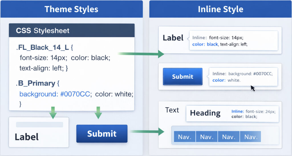
Behind the scenes, FileMaker renders layout styling using CSS (cascading style sheets). When a style is saved to the theme, it becomes part of a single CSS file that is loaded when the solution launches. Any object using that style simply references the CSS definition, which improves rendering performance and keeps layouts consistent.
When an object’s attributes are changed directly—for example, adjusting font size or toggling bold—the object becomes detached from its saved style. Objects with unsaved styling behave similarly to inline CSS in web development. Instead of referencing a shared definition, each object must be rendered individually. As more objects accumulate unsaved styles, layout performance can begin to suffer.
Naming conventions: The secret to reusability
One of the biggest challenges with styling in FileMaker is simply the number of layout objects that exist within a solution. Without a clear naming system, styles quickly become difficult to manage.
A practical strategy is to structure style names using two components: the object type and the style attributes. Because FileMaker requires style names to be unique across all object types, using a prefix for the object category allows attribute names to be reused without conflict. For example:
- FL: Field Labels (e.g., FL Black 14 L for a black, 14pt, left-aligned label)
- BB: Button Bars
- B: Single Buttons
- T: Other Text
Borrowing conventions from web design can also help establish hierarchy. Labels such as H1, H2, and p make it immediately clear which styles represent headings and which represent body text. This pattern makes it incredibly easy for a new developer to step into a solution and know exactly which style to apply.
These approaches can be combined into descriptive yet structured style names. A style such as:
T_H1 24 Black L M
quickly communicates that the object is text, represents a level-one heading, uses a 24-point black font, and is left-aligned and vertically centered.
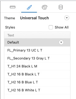
FileMaker does impose a 100-character limit for style names, so it is important to balance clarity with brevity.
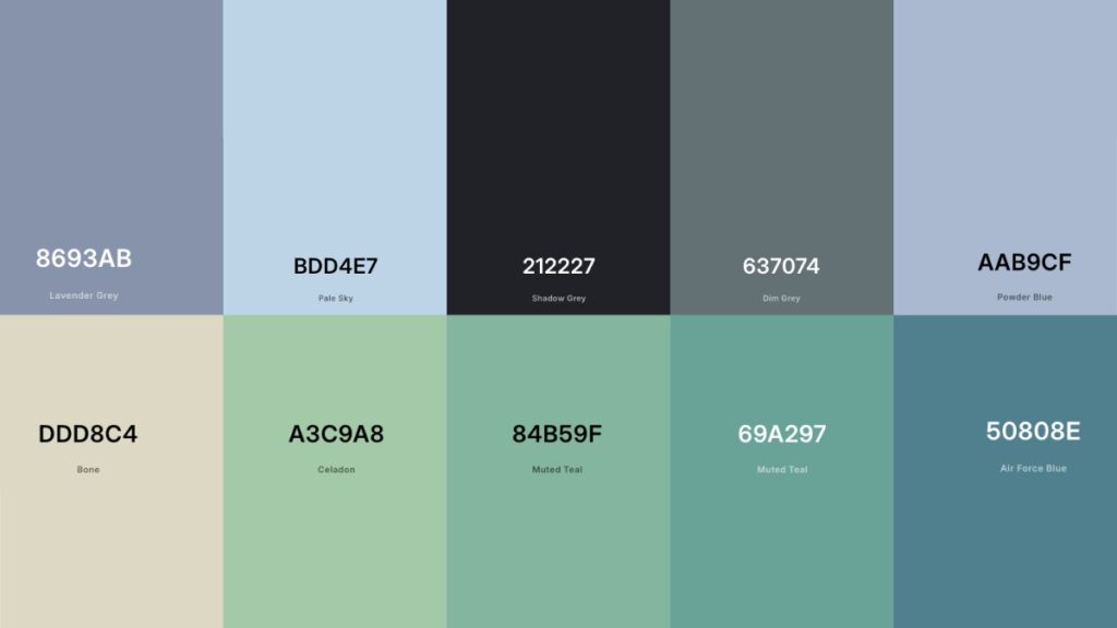
Using color effectively
Color is another aspect of design that developers sometimes overlook. Designers typically establish a color palette before building an interface. Applying a similar approach in FileMaker can help maintain visual consistency throughout a solution.
A practical starting point is the client’s existing brand colors – a company’s logo often provides a natural foundation for a palette. From there, it’s easy to build out a small set of complementary colors, which the client may already have chosen, to be used throughout the interface.
A simple palette might include:
- A primary color used for buttons and key interface elements
- A secondary color for headings or secondary actions
- Supporting colors used for highlights, alerts, and emphasis
Tools such as ColorHexa and Coolors make this process straightforward. By entering a base color, these tools can generate harmonious palettes using complementary, analogous, or split-complementary color schemes.
Putting it all together
Once themes, styles, and colors are established, it can be helpful to create a “legend” layout within the solution. This layout acts as a visual style guide and contains examples of every styled object used throughout the application.
Buttons, portals, text objects, fields, and other layout components can all appear here using their defined styles. When new layouts are built, developers can reference this layout to maintain consistency.
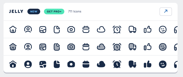
For existing solutions, tools such as FM Perception can help identify objects that are not attached to a style and locate unused styles that can be removed.Icon libraries can also modernize a solution’s appearance. Resources such as Font Awesome and FlatIcon provide large collections of icons that can be integrated into FileMaker layouts.
Balancing budget and project scope
Building and maintaining a structured design system does take time. In some projects, using FileMaker’s built-in themes or starter solutions may be the most practical option. There are also FileMaker-specific themes for sale in the broader marketplace.
A cohesive design system ultimately benefits both developers and users. By implementing consistent naming conventions, reusable styles, and a defined color palette, FileMaker solutions become easier to maintain, easier to scale, and more professional in their overall presentation.
Clear typography, thoughtful color usage, and consistent layout structure contribute to accessibility and usability. Larger fonts, improved contrast, and clearer visual hierarchy provide tangible value that goes beyond mere aesthetics and can significantly improve the experience for everyone.
This piece represents a collaboration between the human authors and AI technologies, which assisted in both drafting and refinement. The authors maintain full responsibility for the final content.