
FM19 Add-On Spotlight: Photo Gallery
Have you ever wanted to view your Claris FileMaker photos in a full-screen tile view or use a gallery of images as an interactive user interface? Traditionally, native image management within the Claris FileMaker environment has been limited, but the new Photo Gallery Add-On looks to change that.
In the fourth installment of our Claris FileMaker Add-On series, we will be implementing and reviewing our experience with the Photo Gallery Add-On.
Requirements
The requirements for the Photo Gallery are minimal, but it’s important to have them taken care of before installing the add-on.
-
Make sure you’ve updated to at least Claris FileMaker Pro 19.1.3
-
Prepare a layout that will hold the add-on Web Viewer object (at least 750 x 482 pt).
Installation
Claris FileMaker has really made the add-on installation process as seamless as possible. You simply follow these steps:
-
Enter layout mode
-
Go to the Add-Ons tab
-
Click the + button at the bottom-left
-
Select the Photo Gallery
-
Click “Choose”
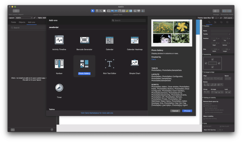
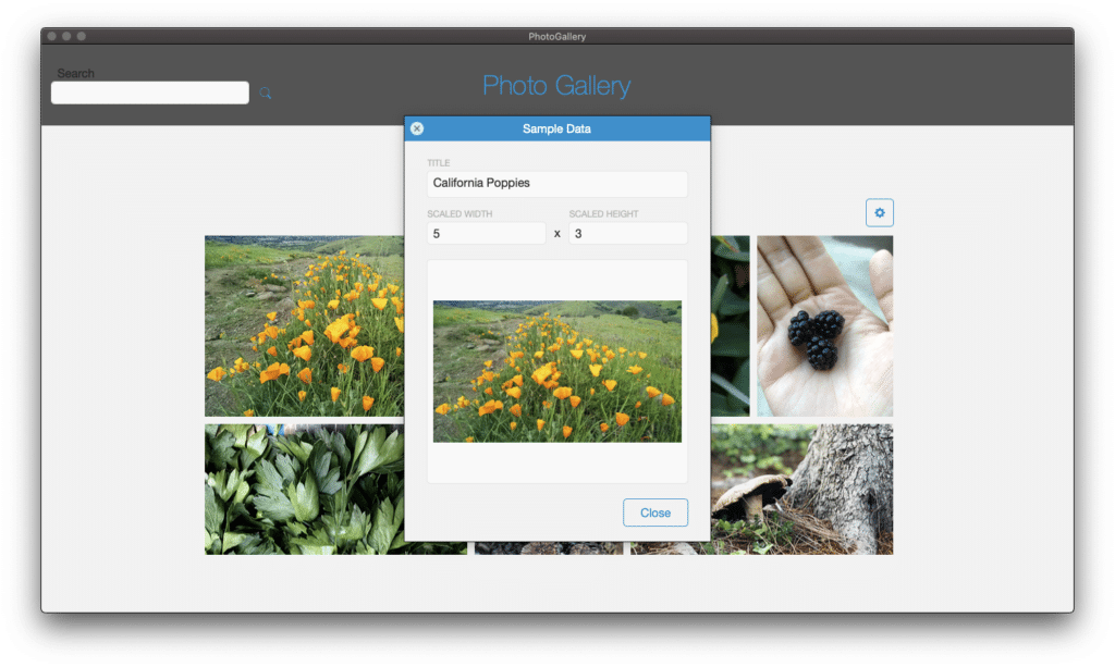
Once the Photo Gallery add-on is installed, simply drag-and-drop it onto your prepared layout. When you return to browse mode, you will see the sample photos from the newly installed PhotoGallerySampleData table provided by the add-on. Now is a good time to get a feel for the photo gallery using the sample data. You can click on a photo which will open a FileMaker card window with the photo’s details. You can edit the image’s dimensions, title and replace the image.
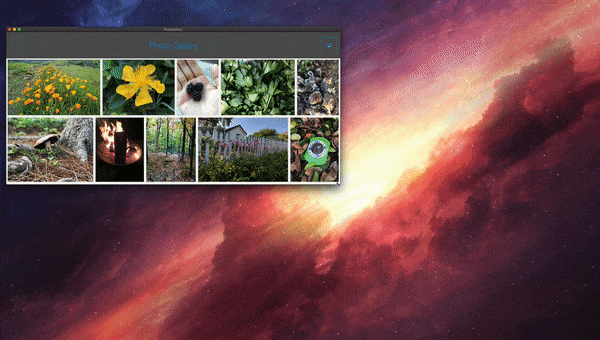
One of my favorite features of the photo gallery is its responsiveness. As you resize the window, the photos can dynamically adjust to your window size.
To make sure this action works properly, you need to anchor all four sides of the web viewer so it will resize along with the window. Be aware, when making this adjustment, the settings button is initially grouped with the webviewer. I chose to just ungroup the settings button and move it to the top.
Implementing Into Your Solution
Once you are ready to implement the add-on using your own data, you’ll need to make sure you have the appropriate fields in your own table.
Required fields:
-
Primary Key
-
Scale Width
-
Scale Height
-
Photo – This field points to either a container field or a Base64-encoded field (see the sample data table). If the file with the add-on is hosted, you can use the container field. Local files require the Base64-encoded field.
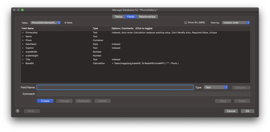
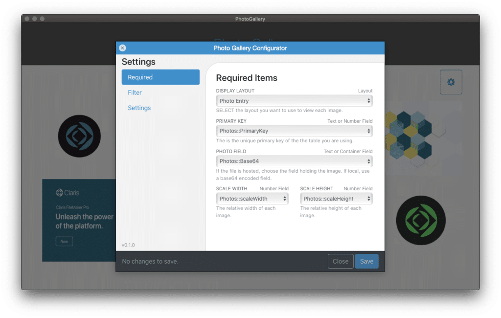
If needed, you can copy the required fields from the PhotoGallerySampleData table, provided by the add-on. Once you have your fields in place, you can re-assign the “Required Items” from the sample data fields to your internal table’s fields using the Photo Gallery Configurator. The configurator is accessed using the settings wheel button.
-
Display Layout: Card window that will display photo details.
-
Primary Key: Your photo table’s primary key field.
-
Photo Field: Local file requires Base64, Hosted can use container field.
-
Scale Width: Native width of the photo.
-
Scale Height: Native height of the photo.
Using the Photo Gallery
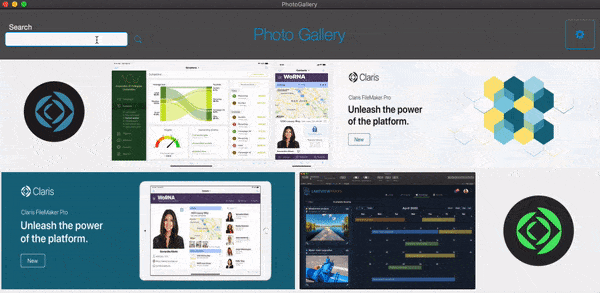
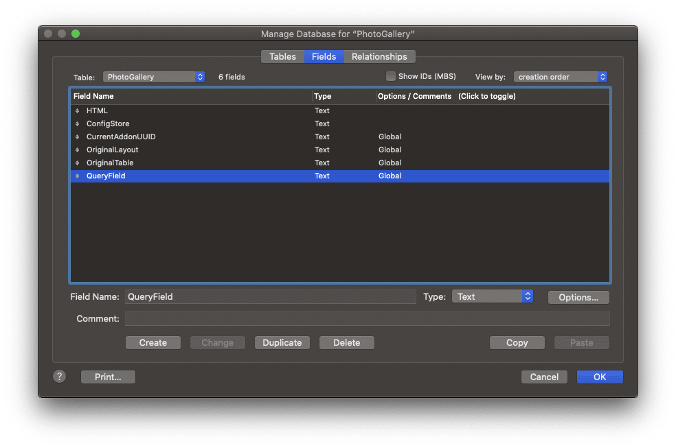
As an additional feature, the add-on gives you the ability to dynamically query and filter images in the gallery. A PhotoGallery table was provided by the add-on that includes a “QueryField”. The query field needs to be placed on the appropriate layout BEFORE assigning in the filter settings.
I decided to use the pre-built “QueryField” field located in the PhotoGallery table for my ‘QUERY FIELD’. For the setting ‘SEARCH FIELD’, you may use any photo data field from your internal photo table. In my case, I chose the title of the photo from my internal photos table.
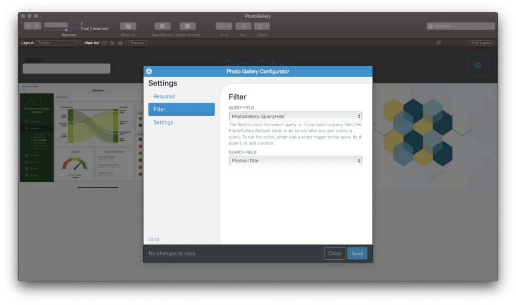
If you are adding this process to your layout, take note of the instructions about the query field.
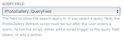
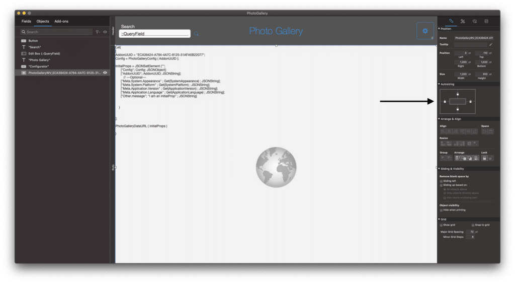
When using the PhotoGallery Refresh script, you will need to send the add-on UUID as a script parameter. The “AddonUUID” can be quickly found embedded in the web viewer as seen below.
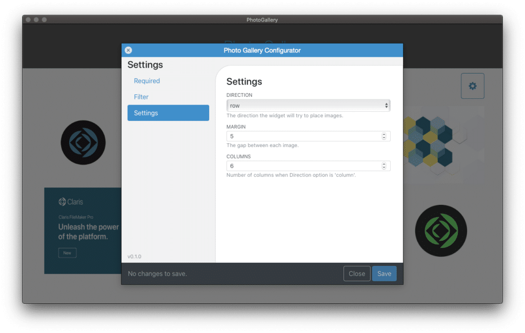
In addition to the filter, the configurator allows margin and column adjustments under the “Settings” tab. You are able to choose if images are shown in rows or columns, how many rows/columns and the margin in between the images. This feature allows for further adjustability and control of the gallery display.
Conclusion
Overall, the Photo Gallery add-on allows photos and images to be viewed in a way you don’t normally get in Claris FileMaker. The ability to click on a photo in the webviewer and perform an action within the solution is very useful. I can imagine using the photo gallery as an interactive Claris FileMaker UI. Also, easily implementing and performing an image metadata query/filter is something I definitely want to explore in the future. There seems to be many use-cases for the subtle, yet powerful features of the Photo Gallery add-on.
For potential improvements in the future, the ability to sort the gallery images would be a very helpful feature. I was disappointed PDFs could not be viewed in the gallery, but on the other hand, GIFs work great!

If Portage Bay Solutions can help with your Claris FileMaker solution and/or you want help with integration of the Photo Gallery add-on, please submit the contact form below with any comments or questions you may have.
Thanks for reading!